

Avoid these Mistakes with your Book Cover!
9/24/2025 | Shannon Winton
It feels like a cosmic joke that people decide whether they want to read a book based off pictures, but humans are, for better or worse, visual, which means you need to have a great cover to convince people who aren’t your family or best friend that the amalgam of your blood, sweat, and tears is worth their time. That’s right, actual fans of your genre—people who don’t know you and that you haven’t directly told how cool your book is—will look at your book and judge it by the cover, and you cannot tell the police to go arrest them for perpetrating this injustice because the cops will laugh at you. We truly live in the worst possible reality, don’t we?
But this is our lot, and the skills that made you an excellent writer aren’t necessarily the same skills that will help you create an enticing cover. So how do you do that? Even if you aren’t an artist?
Let’s talk about basic design, common issues new authors make, and ways to figure out how to hit genre expectations when it comes to your cover in your market.
First, as a formality, hiring a professional is one of the steps to making a professional cover, especially if you don’t magically have a background in graphic design or a handy dandy MFA in art appreciation you can whip out for occasions just like this. In cases like this, storebought isn’t just fine, it’s probably significantly better than anything you can produce yourself, so carving out a budget for a good cover designer is smart. If you’re working on a minimal budget, premade covers may be more realistic for you, but you’ll still need a good understanding of what a good cover looks like to purchase it. If you are working on no budget, you’ll be paying in time because you’ll spend a non-zero number of hours in Canva or other art programs trying to get elements to fit together and learning how to change kerning on fonts, and you’ll probably end up having outsized disdain for specific letters. Like, why does a capital P even exist anyway? It’s so top-heavy and dopey but other letters pretty much never fit together with it without all this weird dead space around it. Hateful thing.
Regardless of how you get the cover, recognizing general good cover design in instrumental. So here are a few simply rules that work in almost all occasions for a newbie.
The cover should be eye-catching in full size and as a thumbnail.
This is something that may be different that you’d expect, but yes, the art or graphics should be easily conceptualized when the image is small because the prospective buyer is more likely to see a scaled-down version of the cover on their cell phone or Kindle than they are to view it in full-size physical form on a shelf. Some authors opt for different covers based on format because of this. Please note, being intuitive at a small size and being simple or minimalistic are not the same things. For example, Jen Beagin’s 2023 novel Big Swiss is bombastic and weird and steal’s attention using boobs, the upside-down woman who appears to be mid-fall, and the incredibly bonkers expression and tongue. These things all work even when teensy.

Elements need to draw the eye toward them.
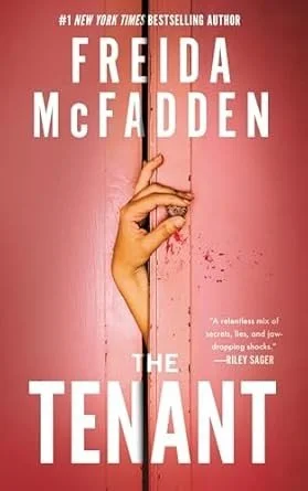
Your visual elements should be striking and clear with enough space to grab the eye without being so chaotic that there’s no real focus. You can learn more about the golden ratio/ Fibonacci spiral, the 30/70 rule, and the rule of thirds. Arguably the easiest for a novice to use is the rule of thirds. This rule basically states that an image is gridded into nine total squares with three vertical and three horizontal lines and that the main visually interesting objects should be placed along the lines or inside zones created by them. Zoning on covers is common because covers tend to have three basic components anyway: the title, the image, and the author’s name. Giving each main element a distinct third or “zone” of the cover is an easy way to build design. For example, Freida McFadden’s The Tenant does this very well. The eye is drawn to the image of the hand and blood on the door, and then up to the italics and the author’s name and then down to the title.
Use fonts that coordinate.
Fonts tend toward two specific styles, serifs and sans serifs. Serif means stroke, and these are fonts with little extra lines at the edges of the letters like Times New Roman, Garamond, and Courier. Sans Serifs do not have this extras, like Aptos, Tahoma, and Arial. Fonts are also split up between monospace/nonproportional and proportional fonts. A monospace font means every letter gets the same size space regardless of if it needs it. A proportional font means wider letters get more space. An easy way to figure out what kind of font you have is by looking at the Ms, If the M looks a little pinched, this is likely a monospace font because the M takes up the same amount of space as a T or an O.

If you’re a newbie, it’s probably best to stick with one kind of font group, i.e. Sans serif monospaced fonts or serif proportional fonts to provide a cohesiveness look to the text elements of your cover. This isn’t to say that covers cannot have multiple types of fonts (and we’ll seem some later in this article), but if you’re creating your own cover and don’t have the skills to alter fonts, mixing can lead to a sense of lopsidedness or that some of the words are dumpy. Using a font group provides visual unity. For example, Andy Wier’s Hail Mary uses multiple monospaced sans serifs for the title/author name, quotes, and headline:

Over in fantasy, Callie Hart’s Quicksilver utilizes proportional serif fonts to great effect:
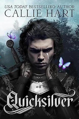
One of the things you might notice is that even though both covers use some stylization in their fonts, they’re both easy to read and distinguish from the background. It’s important that your elements don’t blend in and that the reader can read them. Otherwise, it’s blurry nonsense most readers will be unwilling to investigate. Confusing and alluring are not the same thing.
Pop Quiz!
Before we discuss your specific genre and your specific needs, let’s do a pop quiz. Think fast, can you define at least five things wrong with this cover? Feel free to be mean in your assessment, because prospective readers are not forgiving people.
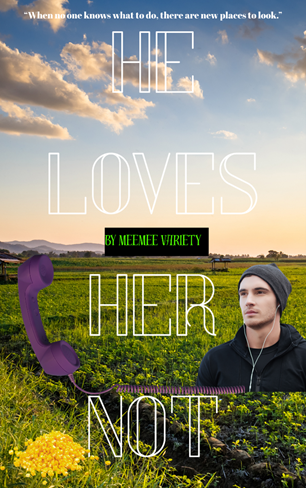
Times up. Did you find the problems? Here are the things I see that don’t work on this cover:
The visuals don’t fit together and clearly didn’t come from an original image. Instead, they’ve obviously been cut and pasted over a picture of a field.
The words are hard to read because the stylization and color cause most of them to blend into the background. It’s especially difficult to see “He Loves.”
The author’s name is small and difficult to read because the font is too small, thin, and pressed together. Even though it’s got a background block to make it stand out, at thumbnail size, it would be illegible.
Now for the extra points:
It’s impossible to tell what genre this is. Broad skies and fields tend toward either religious motivation or literary books, but the Halloween-y style and color of the author name says something more along the lines of horror or possibly sci-fi. The title comes across as possibly women’s fiction or contemporary fiction but could also be psychological thriller or possibly mystery. There’s no telling.
The author’s name is misaligned inside of its little box, and if the cutouts didn’t peg this as amateur, that mistake certainly would.
The quote is nonsense and still doesn’t help pinpoint the genre. The author may think this is evocative and deep, but it’s utterly without context to give it meaning.
There isn’t a central visual element or set of elements that draw the eye. Granted, the guy and his torso do stand out from the field but not in a good way. Instead, it begs the questions, “Where is the rest of his body?” and “Why couldn’t they have been bothered to get the rest of his shoulder on the cover?”
Even though the guy, the landline phone, and the corn are probably instrumental elements of the book itself, they don’t mean anything when lumped together like this. A picture is worth a thousand words, but sometimes those words are just “huh” and “what” repeated five hundred times each.
I asked for five, but did you find them all? Especially that last one? This was kind of a trick to get you thinking about genre and your vision, and whether the two align. New authors often default to believing that thematically important objects or people from the story should be the highlights of the cover. On its face, these seem like good ideas, but doing this can create a pastiche image like the one above that doesn’t engage the audience. For instance, if you were writing a mystery about the search for a WW2 survivors gold, and an important clue was inside his granddaughter’s pink elephant stuffy, and before the war, he had been a banker but became a stage actor afterward, having a pink elephant, a bank, a tank, and a stage with a pile of money would not adequately convey what this story is about even though all of those elements are important to the plot. Remember, you cannot go to anyone’s house and force them to look at your book. That would be illegal. Then they could call the cops and have you arrested. So you’re going to need to figure out what does actually convey the vibes of the story. Sometimes it will be actual elements of the story, but much of the time, that doesn’t work. Now let’s talk about what does.
What Works
When you start thinking about your cover, it’s important to go look at other books in your genres to see what seems to be working. This isn’t cheating, and I’m not telling you to copy off Ada Cooper in 6th period because you didn’t study for the math test. I’m telling you to research other books in your genre and see if there are commonalities authors (or their cover designers) use to communicate with the audience. Look for things like:
Common visual elements like animals, houses, campfires, people, etc. If all of the alien sci-fi you look at has aliens or spaceships, you know that kind of thing should probably be on your cover too so that your audience is clued in that your book is something they’d like.
Font styles. Some genres are very font-specific and some aren’t, so it’s good to study your genre to see if you should expect to have script, serifs, artistic flourishes, etc. for your textual elements. Holiday romance almost always has a script-style font or a serif with heavy flourishes for example.
Color schemes. We didn’t talk a ton about color schemes, but some genres have quintessential colors, meaning a high percentage use them. For example, red, black, and white are very common in domestic thrillers.
Headlines and quotes. Some covers highlight the series name. Others use the space to talk about how well the author sells. Others use it to show keywords about the book. Others still will say the names of the author’s other successful books or awards they’ve won. See if there are specific facets highlighted in the cover matter, because if it’s a trend, it’s probably one you should follow too.
Test time! Here are some examples from today’s tops in Crafts and Hobbies Cozy Mysteries, and let’s see what you can figure out about the genre by looking at them:


Common visual elements. Now, not all books have a particular image that’s used, but almost all of them have scenery, which tells you that even in crafts and hobbies, destinations and settings are prominent on the covers. One could argue the library is also a setting, so for this genre, it seems like making place, even if it’s indoors, a big element of the cover would be wise. It also appears all the books are illustrative, and that’s a key takeaway too because it’s a style that’s universal to this niche.
Now let’s look at fonts. There’s some variety, but almost all of them use slightly boxy sans serif fonts for at least the subtitle and author information. Tonya Kappes actually mixes serifs and sans here but in a way that works for her instead of against her, and I would not suggest trying this at home, kids. Lucy Connelly’s book once again defies the trend, but the use of a very bookish set of fonts for hers still gives the feeling of mystery.
For color schemes, there aren’t uniform colors, but it does appear there are a lot of blues and greens which isn’t surprising since most of the locations are outside, but also some red and purple as secondary colors. So, the color schemes seem to be related to the cover content, but there is a pretty clear trend here.
Now, let’s look at how the authors are using quotes and headlines. One author uses their secondary text to point out how they’re a top seller, giving the impression they write good books you’ll like. Two authors use a lot of keywords in a one-sentence blurb to describe the content of the book, also good to help the right reader find the book. One author doesn’t have a blurb or headline at all. However, all authors name the series the books are in. None of them directly quote the book, and none of them provide testimonials from other authors in the genre. If you were writing cozy mysteries, I would presume readers don’t really care about those things since none of the best-selling books use them.
Somehow, even with the trends and commonalities, all of these covers have distinction and uniqueness. Doing market research doesn’t mean losing artistic license; it means learning how to connect with your readers so they’ll want to read your book.
One last tip: When you’re looking at your comp covers, try to grab just one cover for an author even if they have multiple books in the top sellers. That way, you won’t confuse the cohesive elements for their author branding as part of the trend for the whole genre. Also try to focus on books that were published in the last few years. Trends change, and a high-selling book that has maintained its place in the market may have cover elements that newer books in the genre don’t. Anything Stephen King published twenty years ago is probably not going to bear a lot of cover similarities to contemporary books even though they still rank really well.
Now it’s your turn. Evaluate the best-selling books in your genre, and see if you find trends to help you create your own cover. Let us know what you discover by tagging us @tomeworksedits!
Feel confident in your cover but not in your plot? Contact us today for a manuscript evaluation. We’d love to help you shore up your plot holes and spruce up your pacing.